
Red Cross GO
Team & incident tracker for high-profile events for the Capital Region Red Cross.
During high-attendance and profile events, the Red Cross will oversee and manage medical and response teams. The Red Cross GO tracker is a redesign of their slow & out-dated system for tracking teams and emergency incidents.
Period: September 2025 - December 2025
Role: Lead Admin UI/UX Designer
Skills: Figma, UX Methods & Research
Advisor: Justin Dowdall
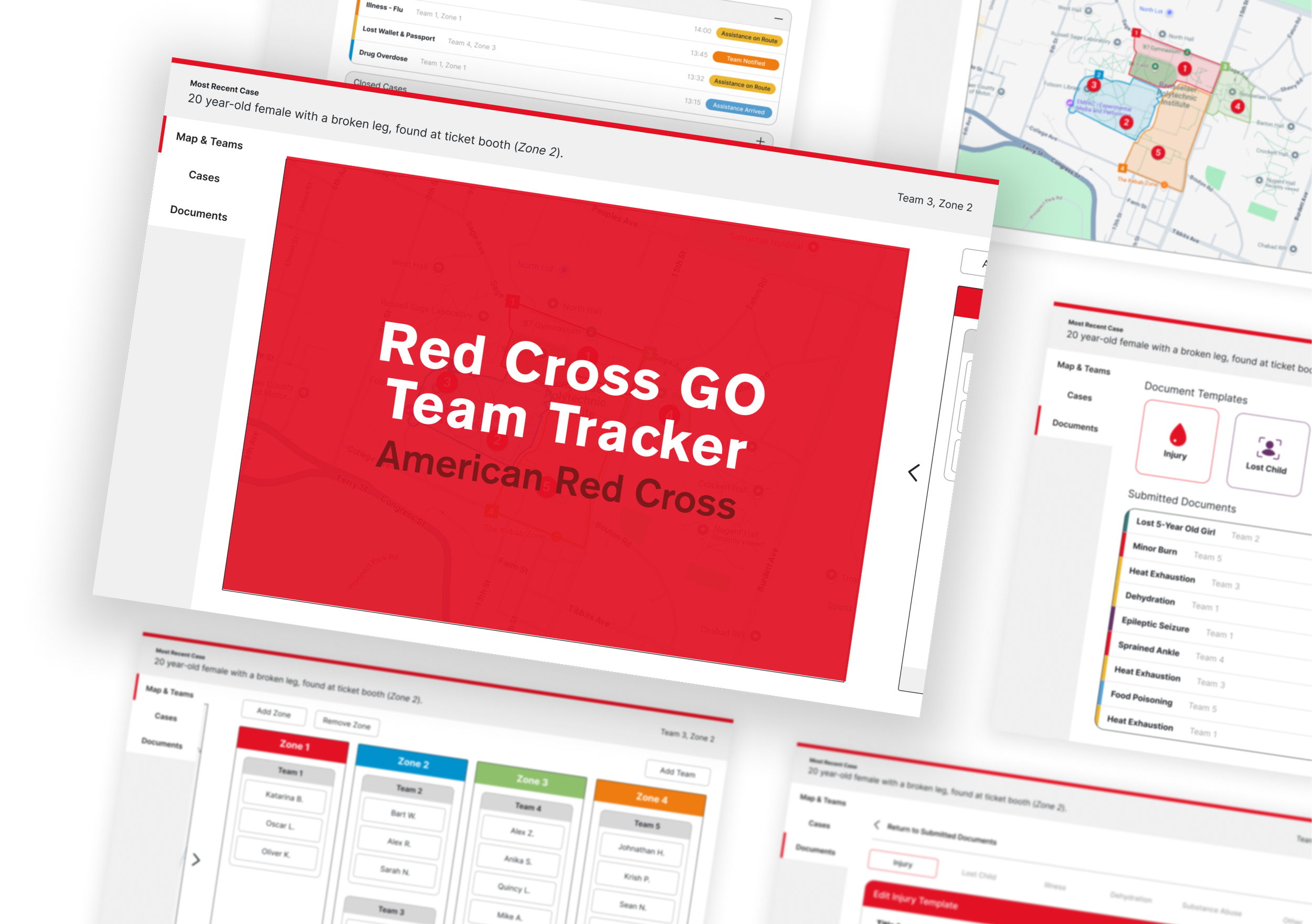
Brief
Propose a redesigned digital product for a local organization with an emphasis on social responsibility & aid.
The American Red Cross
They provide emergency assistance and services during significant events. Their assisting operations are divided into Go Teams (on-the-ground responders), and Admin (HQ control).
My Role
I served as lead UI/UX designer for the Admin-facing components of this project. I organized and delegated the UX research, then parsed and visualized the findings gathered by our researchers. I also created all Admin-view Figma materials and mockups.
Research & Definition
Problem Space
One of team members, Toby, is a volunteer for the local Red Cross branch. During large attendance and high-profile events, Toby has seen the Red Cross’s operations hindered by their out-dated tracking system: a whiteboard.
UX Research
To understand the precise shortcomings of their current system, my team conducted the following research:
Unstructured interviews with 2 Red Cross staff members (Responders AND HQ)
Secondary contextual & competitive analysis research
As designer for the HQ Member dashboard, I parsed the relevant findings.
Information Bottleneck: Whiteboard is only accessible to HQ members, who then need to radio responders to relay changes or incidents.
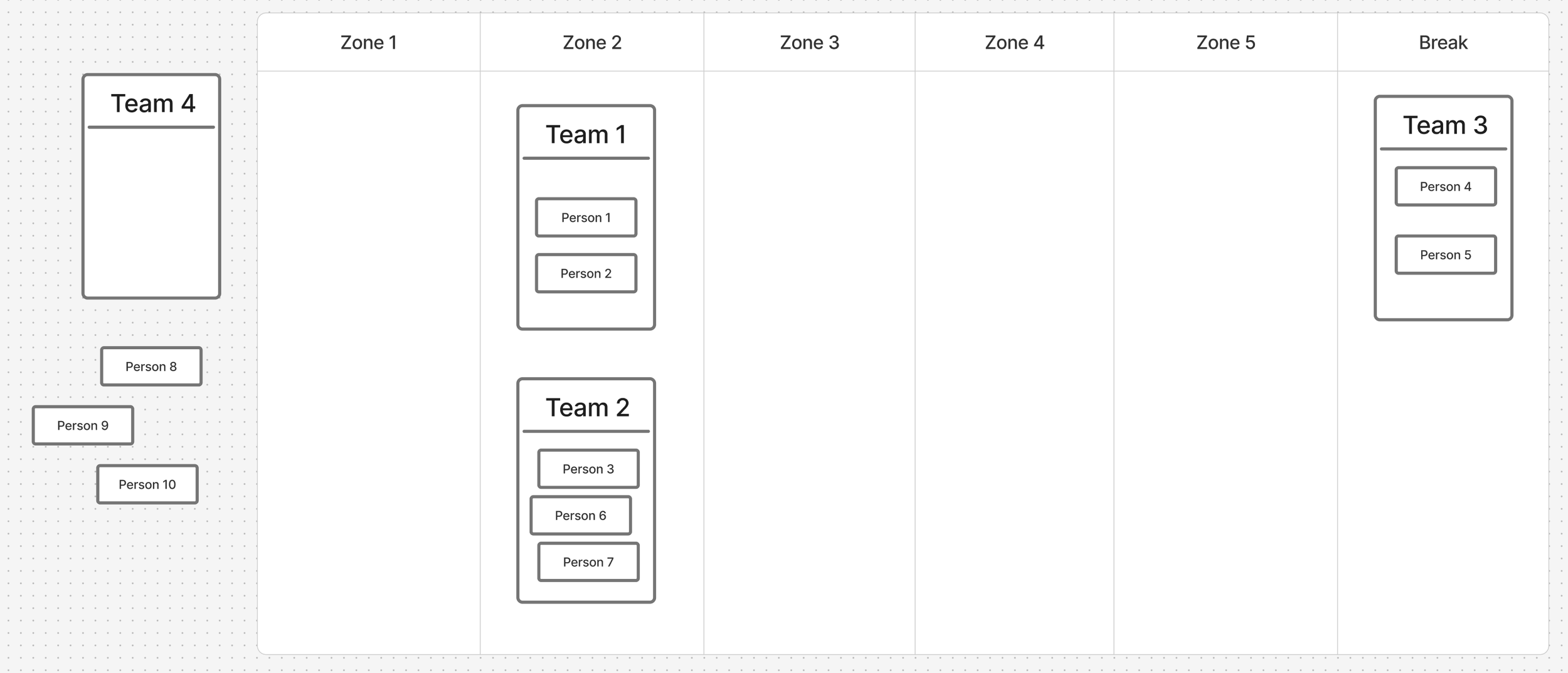
A simple digital recreation of the Red Cross’s whiteboard
No real-time mapping: Responders need positional context for incidents, team locations, and resource movements.
Volunteer management complexity: Tracking status, availability, and safety of responders in real time is difficult during overlapping incidents.
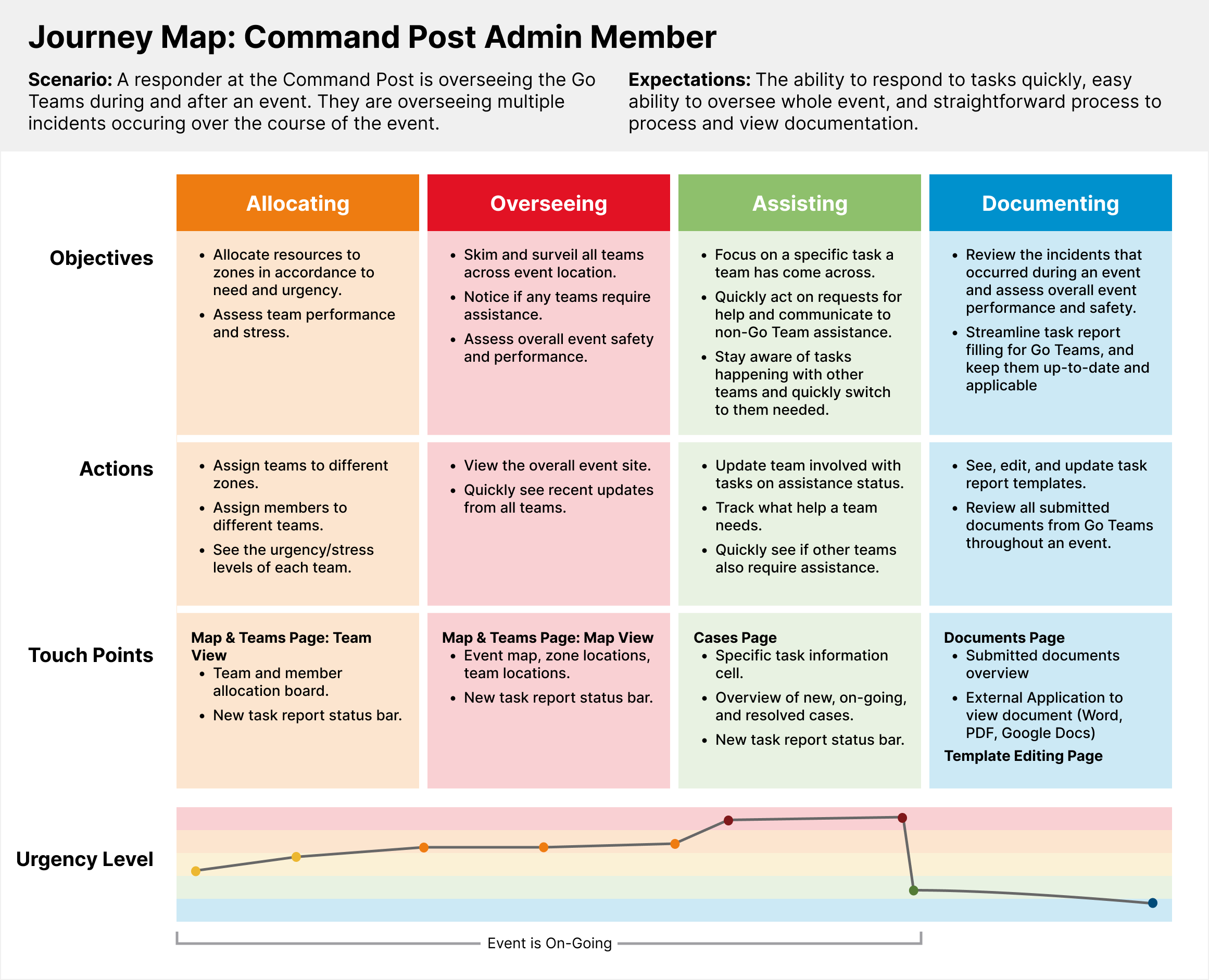
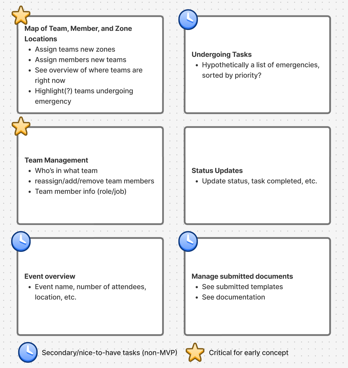
I then condensed these findings into a journey map and feature list.
Ideation & Prototyping
Wireframes
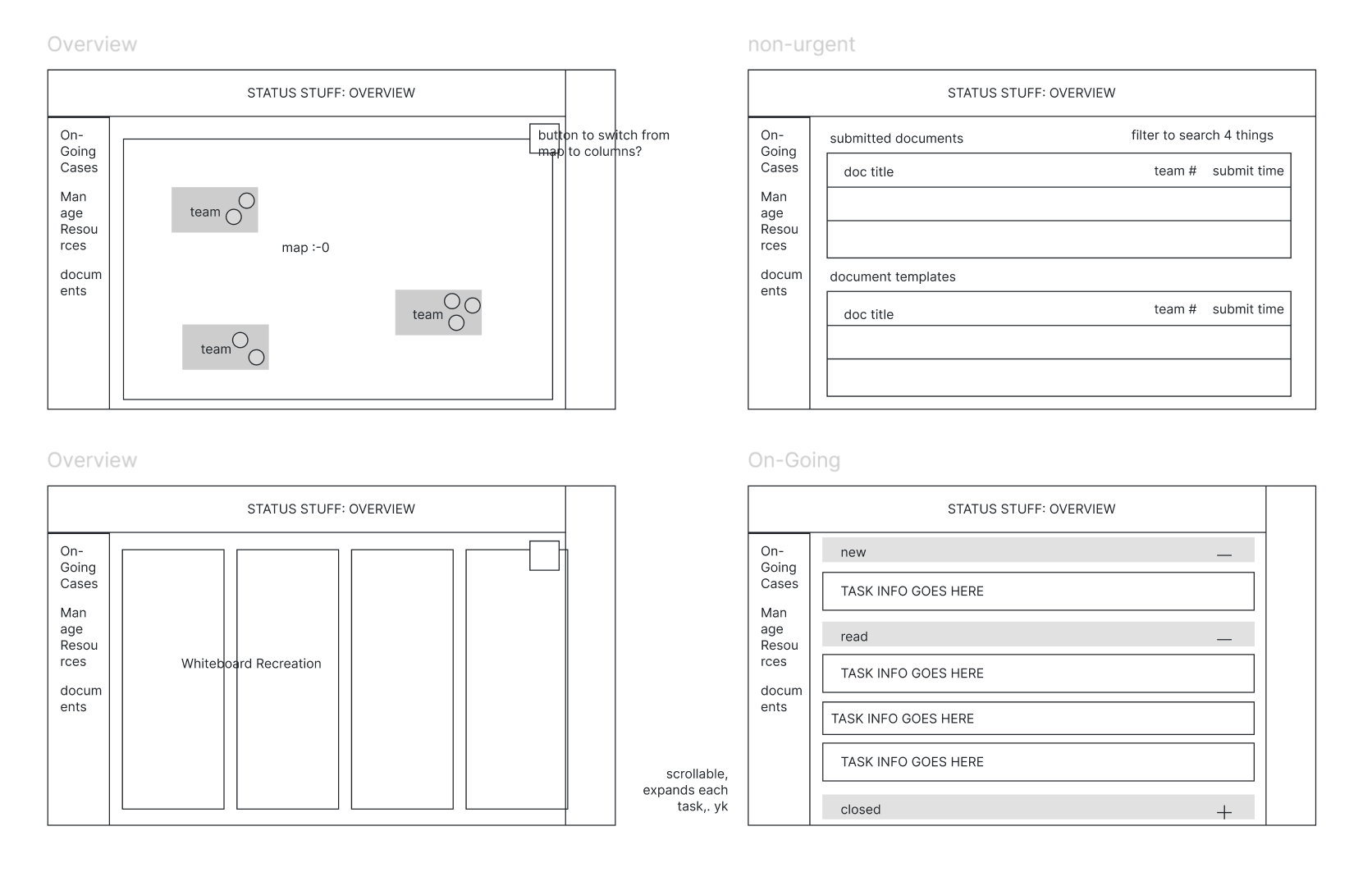
To get the ball rolling, I began with a low-fidelity mock-up of what the admin view-port could look like. This was expected to change as further research was conducted, and was primarily used to convey the concept to our client.
All design materials were made in adherence to the Red Cross’s official brand and accessibility guidelines.
Card-Sorting & Thumbnails
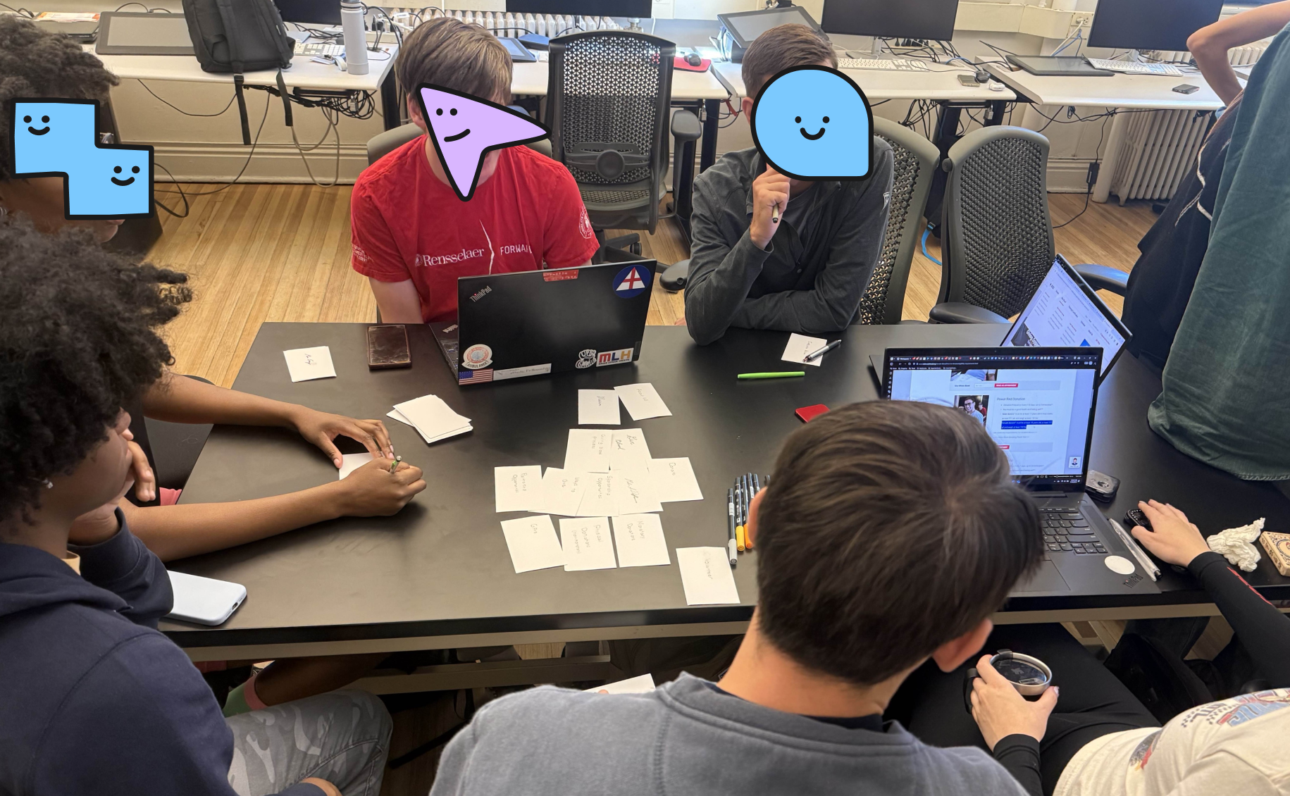
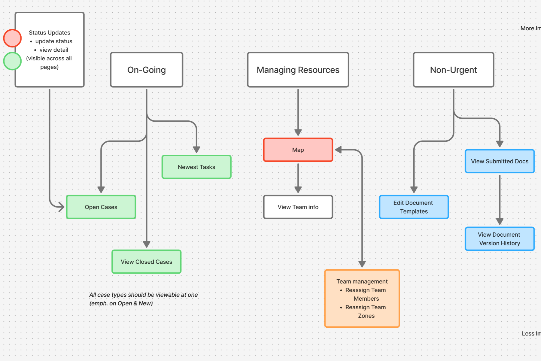
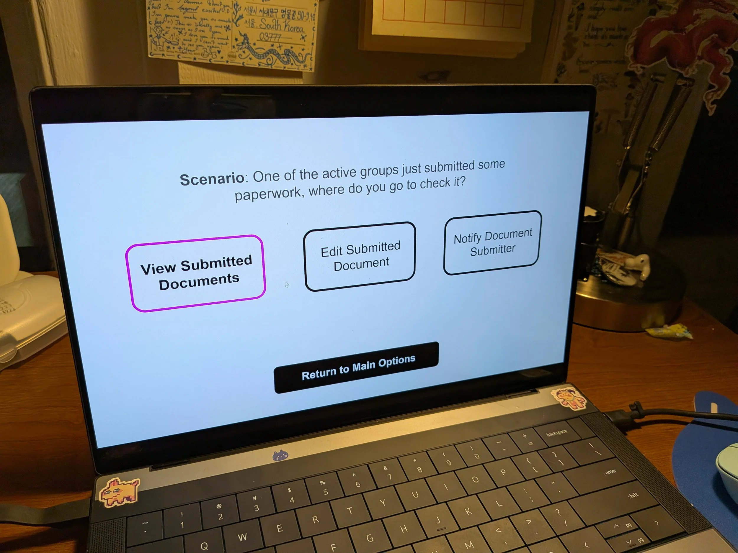
16 card-sorting exercises with 8 participants were then conducted to establish the information architecture of the platform.
Given the platform’s high-pressure setting, relying on established mental models and intuitive organization would ensure easy access to critical functions.
I condensed the card-sorting findings into a site-map, then sketched some very rough thumbnails to visualize this layout.
Tree Testing & Mockup
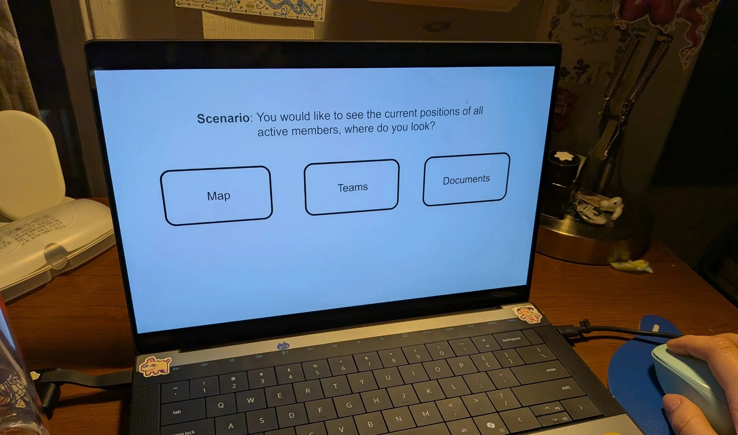
To confirm this reorganization, the team conducted tree tests with 10 random participants.
The findings confirmed that the shallow tree-depth and limited page count made for an easy-to-navigate experience.
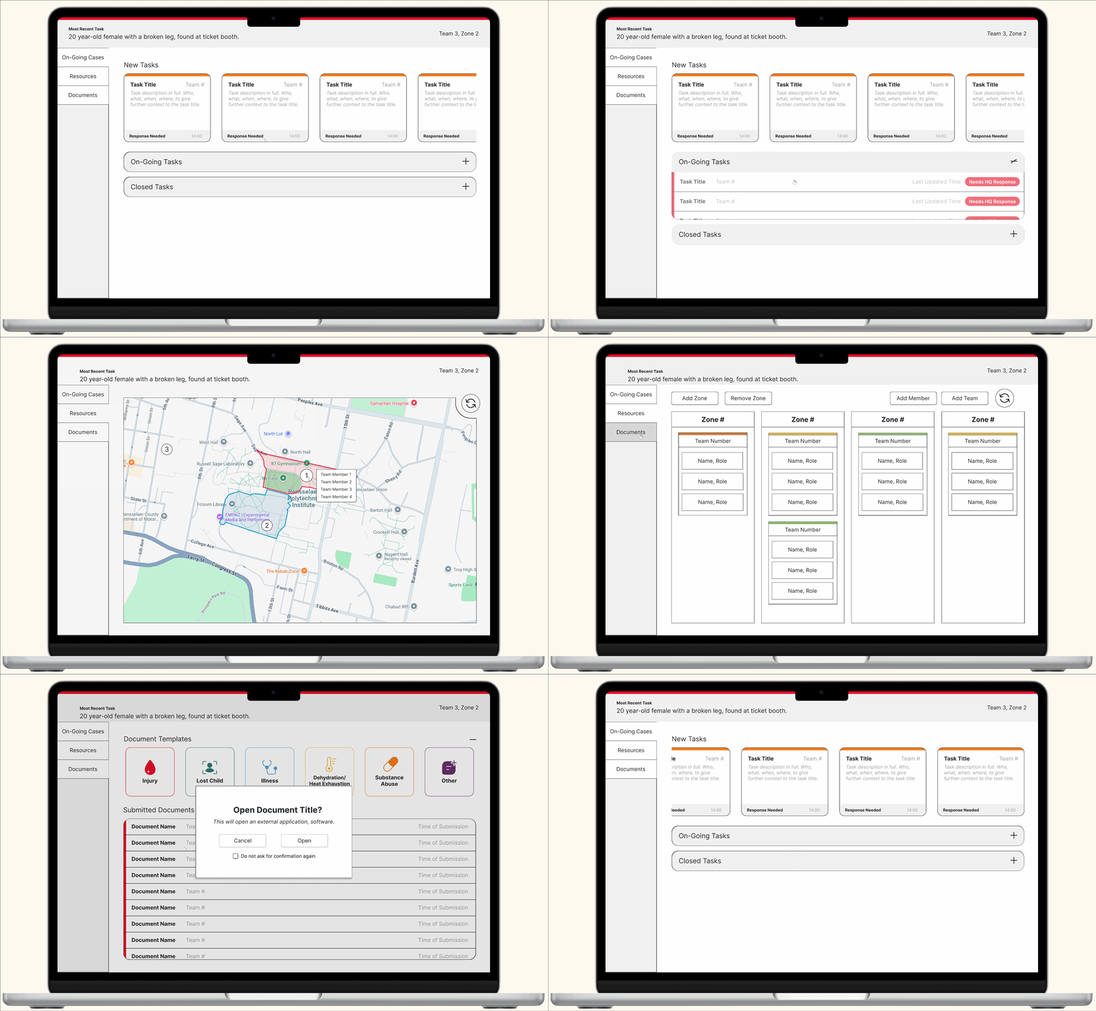
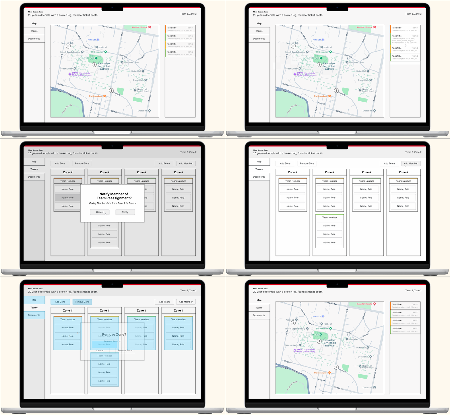
With the platform organization confirmed, I developed a medium-fidelity mock-up, built upon the first wireframe and mimicking the thumbnailed layouts.
Final Prototyping & Testing
Unstructured Walkthroughs
Using the medium-fidelity mock-up, 3 walkthroughs were conducted. These were performed with non-client testers, establishing a baseline of UI usability and providing feedback on visual design choices.
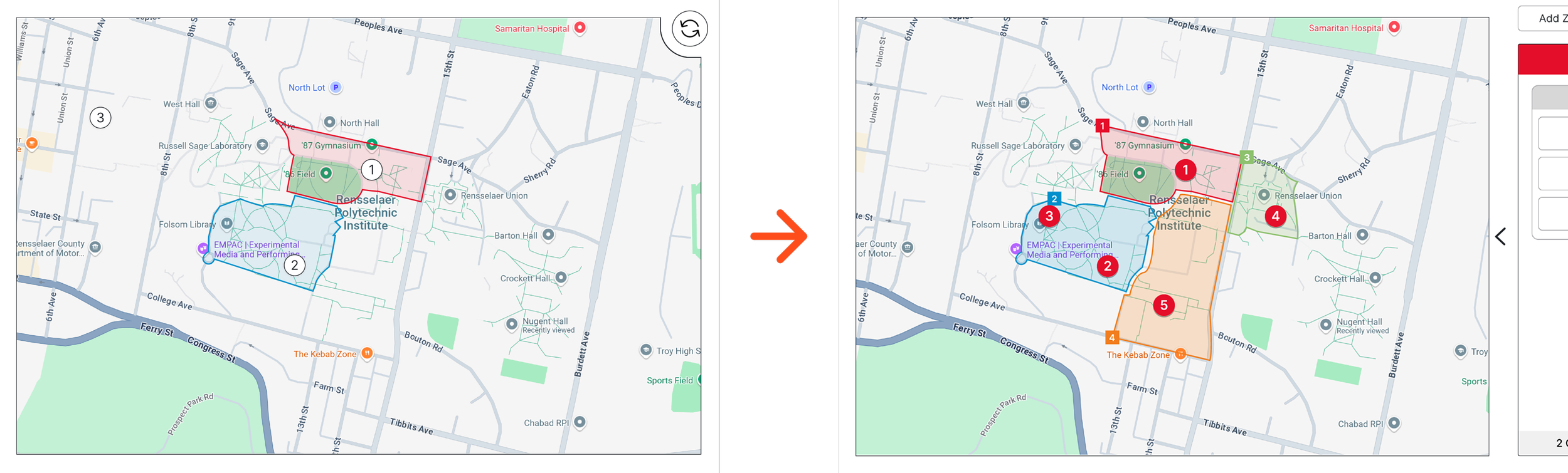
This led to minor design tweaks and rewordings:
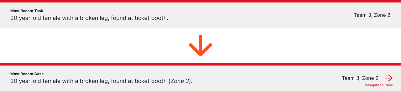
Unifying language across the platform (Task vs. Case)
Changing the interaction to swap from Map to Team views
Linking the “Most Recent Case” to its entry in the cases page
etc…
Final Prototype
These tweaks were all implemented into the final Figma prototype. This was reviewed by all team members, including our accessibility lead, and our project advisor. This ensured the prototype’s quality, visual fidelity, and brand adherence, in preparation for the final usability tests and proposal.
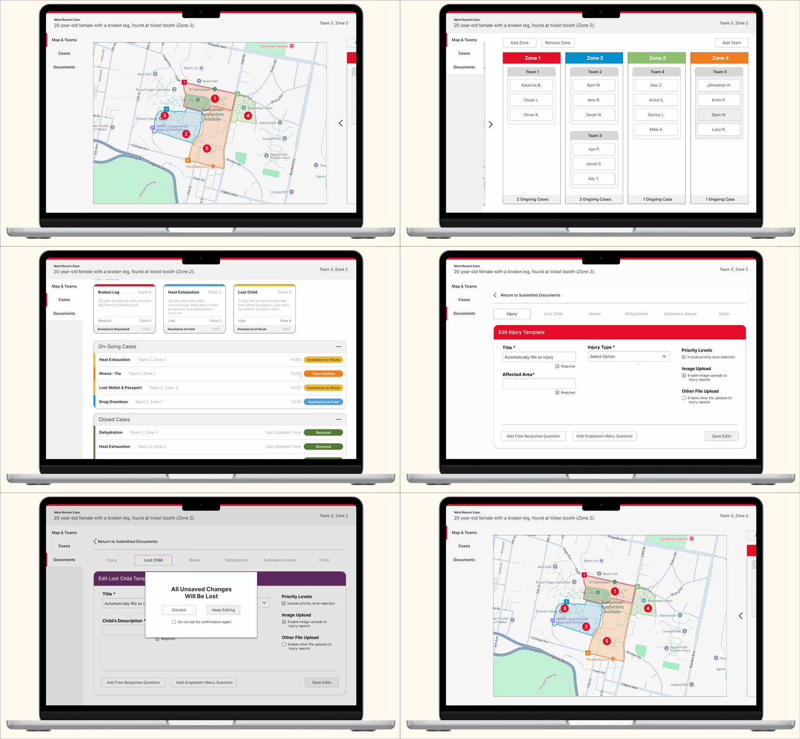
Or view the prototype here
Final Usability Testing & Proposal
Usability testing was conducted on the final prototype with a wide variety of potential users, including trained Red Cross volunteers, first responders, and several individuals who were completely new to the system.
We then presented our final project and documentation to the local Red Cross branch management.
Reflections
Looking Back
This project was my first experience in overseeing, but not personally conducting UX research. This allowed for far more extensive findings, which led to some valuable UI developments. It was also very rewarding to work for such an impactful, significant organization!
Looking Forward
In an exciting development, the Capital region Red Cross branch has expressed interest in taking our project into formal use! Our team has begun the process of choosing development and distribution paths, and hopefully there shall be more to come.